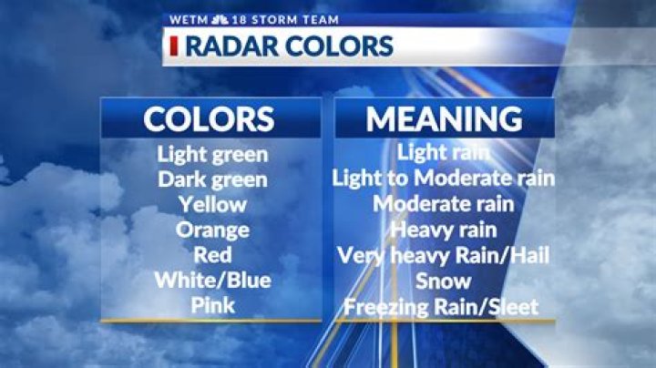
What do the colors of the city dots mean on the map?
For example New York is red (10M population), Boston is blue (4.5M) and Cincinnati is grey (2M). It seems the colors correspond to the population, but what are the thresholds? Is there anything special that the colors themselves dictate beyond an estimation of population?
3 Answers
The colors are used to tell which class the airport is, there are 3 classes:
- class 1 (black)
- class 2 (blue)
- class 3 (red)
The main difference is related to where an airplane of a specific class can land: an airplane of class 2, for example, can land just on class 2 or 3 airports.
Once you get a class 2 airplane, you'll use the colored dot on the Jobs screen as a handy way to spot jobs that can go directly to another Class 2 (or better) airport so that you maximize the effectiveness of your Class 2 plane.
The colors indicate the population:
Black city : 0.0 - 3.9 million
Blue city: 4.0 - 7.9 million
Red city: 8.0 - 10.0 million
lolplanes is right. If you look at the map, cities like New York and London are red and say 10.0m (10 million) underneath the names. Therefore these places are more expensive because of the population. I dont know if class has any relation to this, but the colors for sure mean population.